

To build an app that helps modern travelers with planning their next trip. Conduct a research plan to discover if users would benefit from an app that would show destinations based on the user inputs of location, flights, hotels, activities, and budget.
Identified the problem that we set out to solve, worked alongside colleagues to conduct research, developed personas, facilitated interviews/testings, and created wireframes.
“Want to go a place that is within budget, however something is fun and exotic too” – Jamil
Try to build an app that helps modern travelers with planning their next trip
Conducted a research plan to discover if users would benefit from an app that would show destinations based on the user inputs of location, flights, hotels, activities, and budget.

Conducted user interviews to collect qualitative data. Synthesizing the data that was collected into proto-persona, empathy and affinity maps created an ideal user-persona

Within our UX/UI Bootcamp at Georgia Tech, we were assigned to create a mobile app for modern-day travelers.
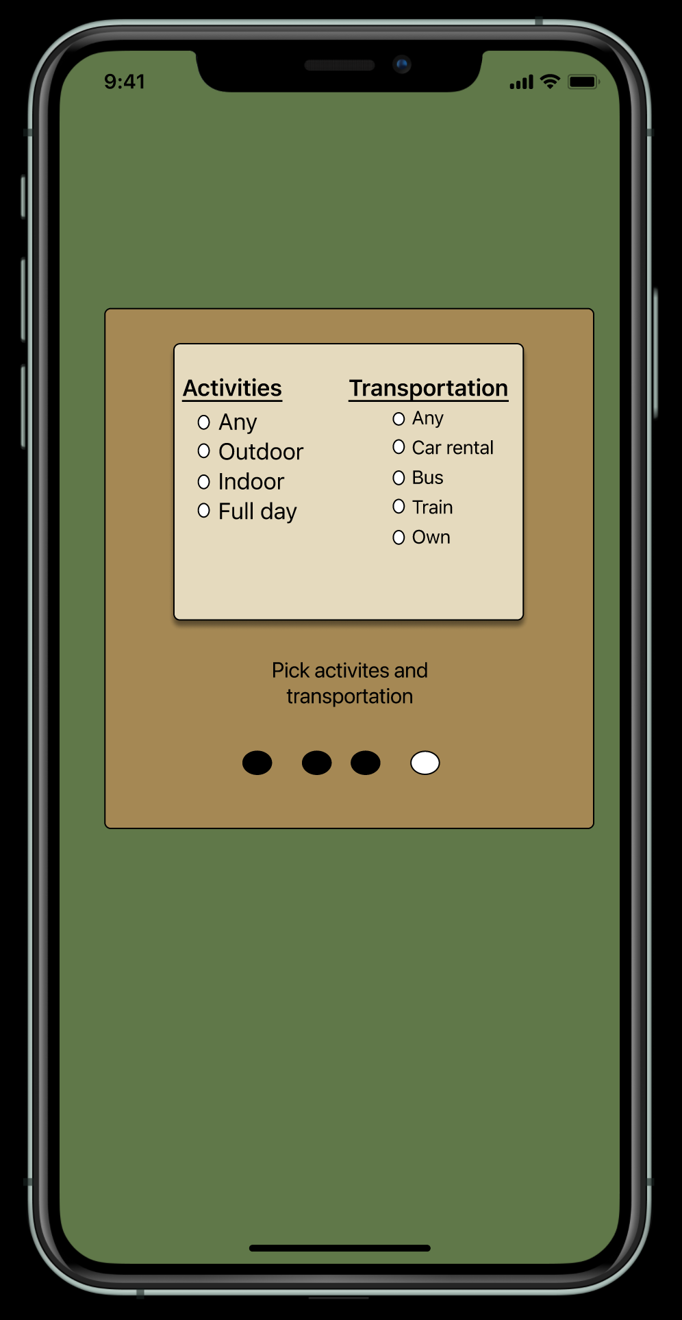
Develop a mobile app to help modern travelers plan their next trip by centralizing everything to a single app, simplify the design, and have ease of use.
6-week project with challenging fixed deadlines/milestones. Some constraints regarding meeting users for interviews/testing via zoom during the COVID pandemic.
Once our initial user interviews were completed, we could construct an affinity diagram from the results. This allowed us to process, sort, and identify critical insights into the information we gained from the users. From there, we generated and consolidated the data related to the product and the problems we wanted to solve.


During interviews, I discovered that Haroon is a perfectionist and likes to plan everything out from start to finish.
Therefore, if I incorporate all the aspects of planning into a single toll and in that sense, I can create a search engine that searches for a destination based on interest, budget, and activities.
We might be able to do this by creating a search that incorporates all the deals and packages deal all across different websites, which would help reduce the stress of mapping everything out.
Haroon, a tech-savvy husband that is a perfectionist needs to see all package deals in a single location to have a less emotional toll on one-self. How might we help Haroon to search for a destination that includes bundling destinations and activities?
For travelers, who are looking for cost to fun ration when traveling, our application “Wayward Explorer” will let users input their interest, their budget, and the activities they want to do, the results will build a bunding package that will be generated from user inputs, which in turn will help the travelers reduce the emotional toll, rather than booking out everything individually.
Creating a storyboard helped our team communicate our mission for creating the app both internally and externally to shareholders. It helped us address: who was our redesign targeting? Why would a user want to use our app? It also allowed us to understand the flow of interactions someone might have with the site.

Creating user scenarios creates a reliable narrative to use as a guide. To ideate towards an accurate picture of our user, their world, and how our solution might solve their problems best.

Now that we had a sense of who our primary user would b, we needed to hone our ideas. To allow ourselves to brainstorm with no limitation, we created an “I like, I want, What if?” diagram.
This allowed us to take advantage of all seven rules of brainstorming created by IDEOU:

Creating a feature prioritization matrix helped us to identify the most critical problems to solve first. During this process, we kept the users and the business needs at the forefront.

Subsequently, we thought through our user flow. This process allowed us to think through our design before developing the whole app. By taking this step, we were able to keep the user at the forefront, making sure we addressed their needs and solved the correct problems without getting too deep into the project.
This step is extremely helpful. It allows one to see a visual layout/roadmap of the user flow, providing the opportunity to think through each step and eliminating the possibly of omitting a step.


To understand the competitive landscape, we conducted a deep-dive analysis of direct and in-direct challengers.
To our surprise, there was more competition than we thought. However, there were opportunities to improve the user’s experience in finding a place to donate and alleviating pain points that the competition missed

Fidelity can vary in the areas of visual design, content, and interactivity. There are many types of prototypes, ranging anywhere between the two extremes low- and high-fidelity.Sketches can help designers quickly visualize design ideas in an efficient and low-cost way, so it is an essential skill for UI/UX designers.


After wire-framing and initial usability testing was completed, we started styling the user interface.It was essential to keep it clean, simple, and fun and keep elements of the app similar to those of those popular apps that the users were familiar with. The intent was to eliminate any ample learning curves that come with navigating anew interface.


Learning empathy is an ongoing process; you need to be open to the idea and open to different experiences and ideas that come with it. Understanding the concept will evolve throughout the process.
Enhanced the prototype more and evolve the concept more to the best practices.

